Separate atmosphere from navigation
Graffiti illustrations and textured backgrounds carry the street-inspired identity. A more restrained sans-serif interface gives labels and navigation a consistent voice.
UI DESIGN / GROUP CONCEPT
A hip-hop event website concept for fans and gamers. Graffiti-inspired graphics create the atmosphere; familiar navigation and deliberate button states help visitors find their way.
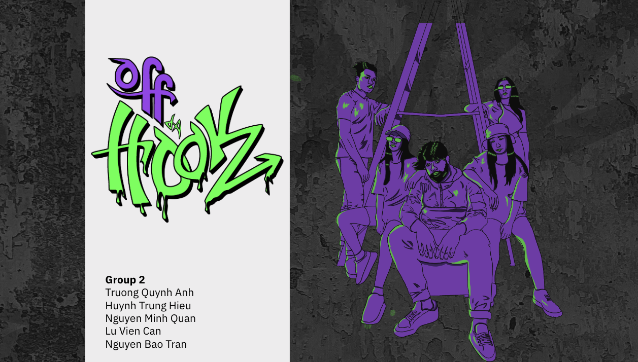
01 / CONTEXT & INTENT
The group presentation identifies hip-hop fans and gamers as the intended audience for a fictional event, Off da Hook 2k40. It also acknowledges a tension in graffiti typography: visual personality can come at the cost of readability. The design combines expressive imagery with a more structured interface.
Graffiti illustrations and textured backgrounds carry the street-inspired identity. A more restrained sans-serif interface gives labels and navigation a consistent voice.
The button sheet shows normal and hover states for purchase, cancel, navigation, and cart controls. The purchase button gains a dripping-paint treatment on hover while retaining its label.
The original work-distribution slide credits Anne with the process journal, button design, and sponsors page. Desktop and mobile UI/UX were assigned to other teammates; this is presented as a group project.
A walkthrough of the documented experience.
Understand the event identity.
Browse program and artists.
Find the ticket action.
Continue through the prototype.
Original screens and process material. Select an image to inspect it at full size.
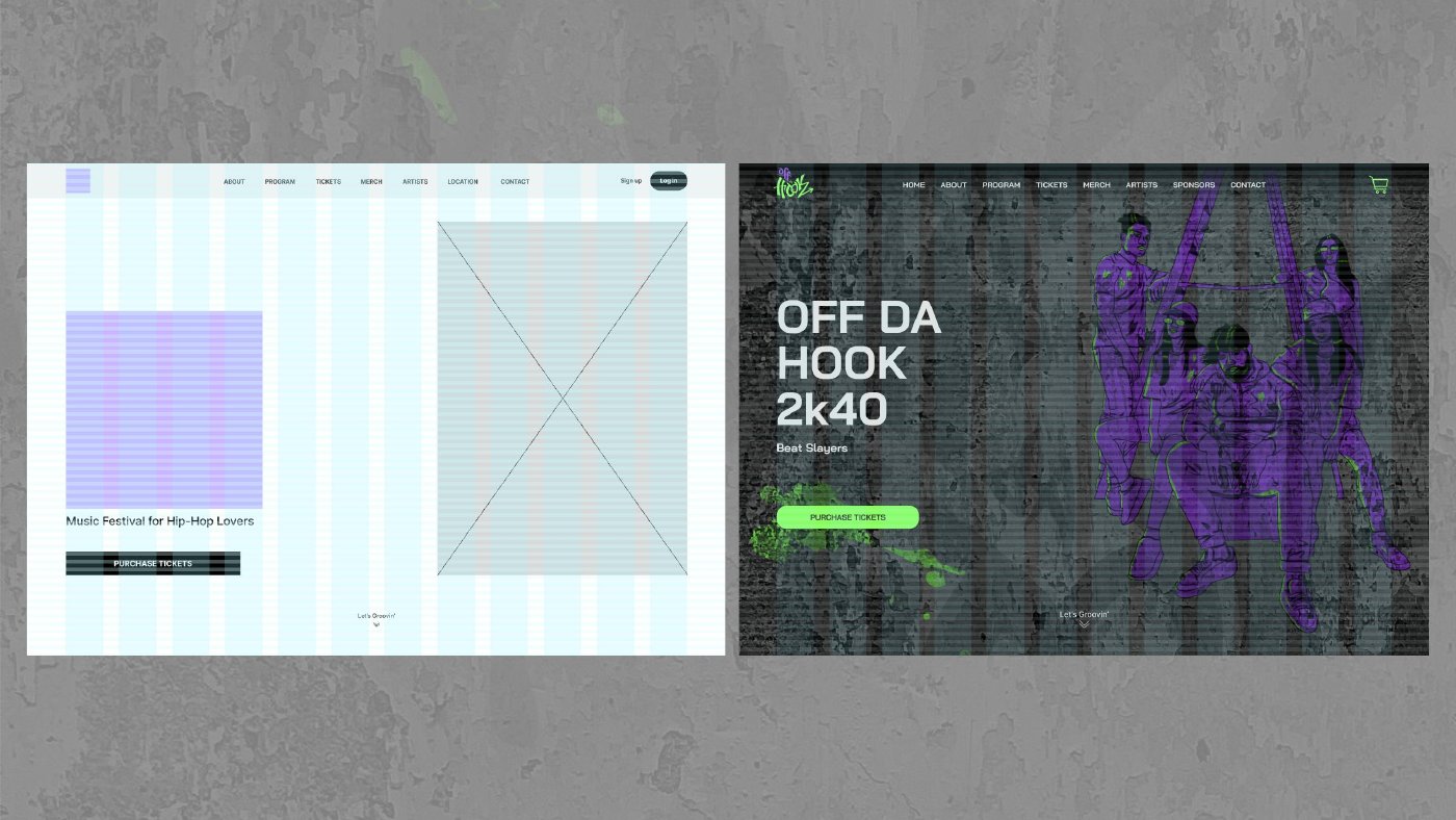
Original presentation, p. 24: the desktop composition before and after visual styling.
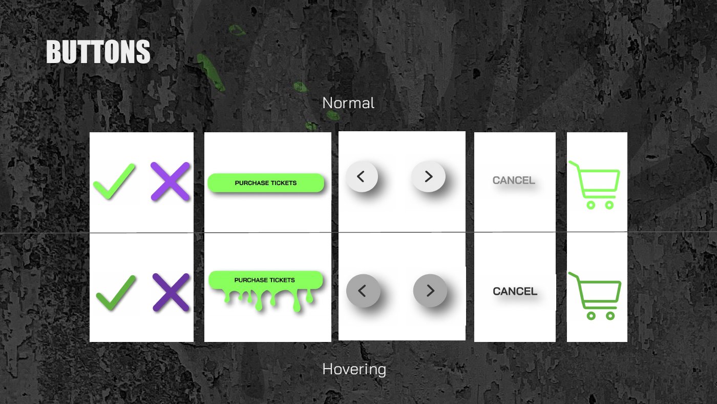
Original presentation, p. 18: Anne’s documented button-design contribution.
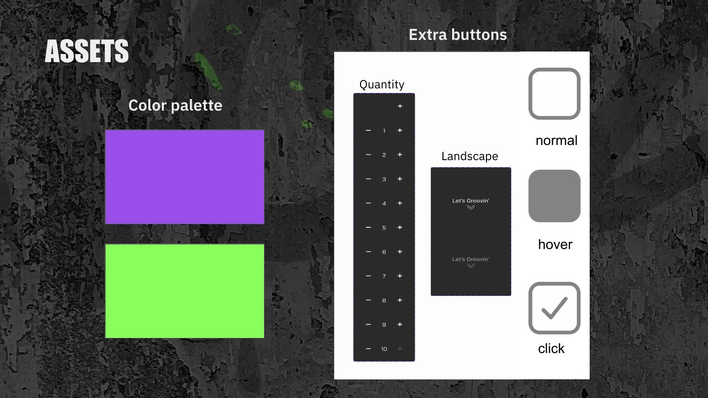
Original presentation, p. 19: quantity controls and normal, hover, and click treatments.
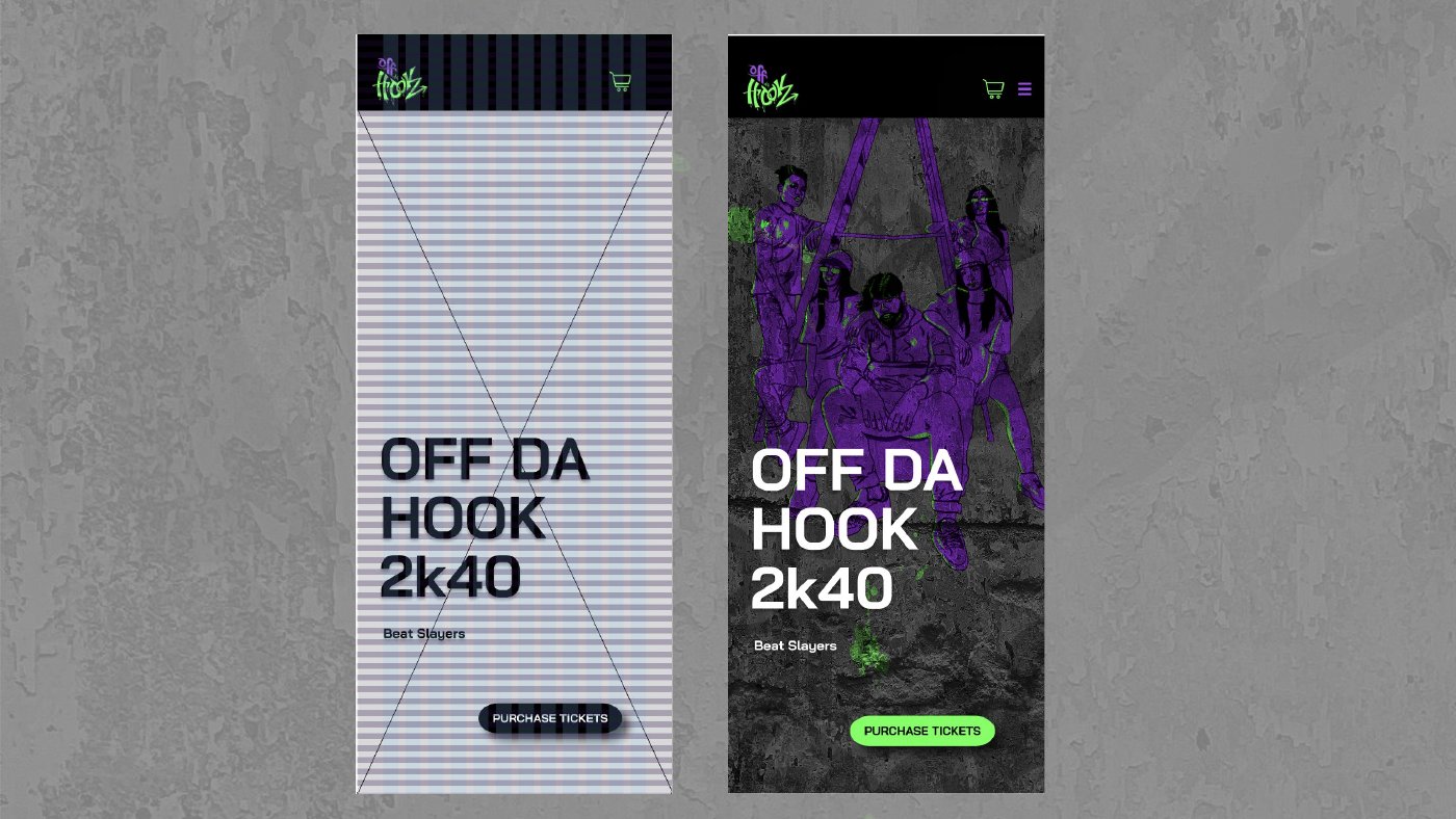
Original presentation, p. 32: a mobile design exploration by the group.
Scroll through the original exported layouts. Switch between desktop and mobile to compare the compositions. These are design exports; open the Figma prototype for the original click-through flow.
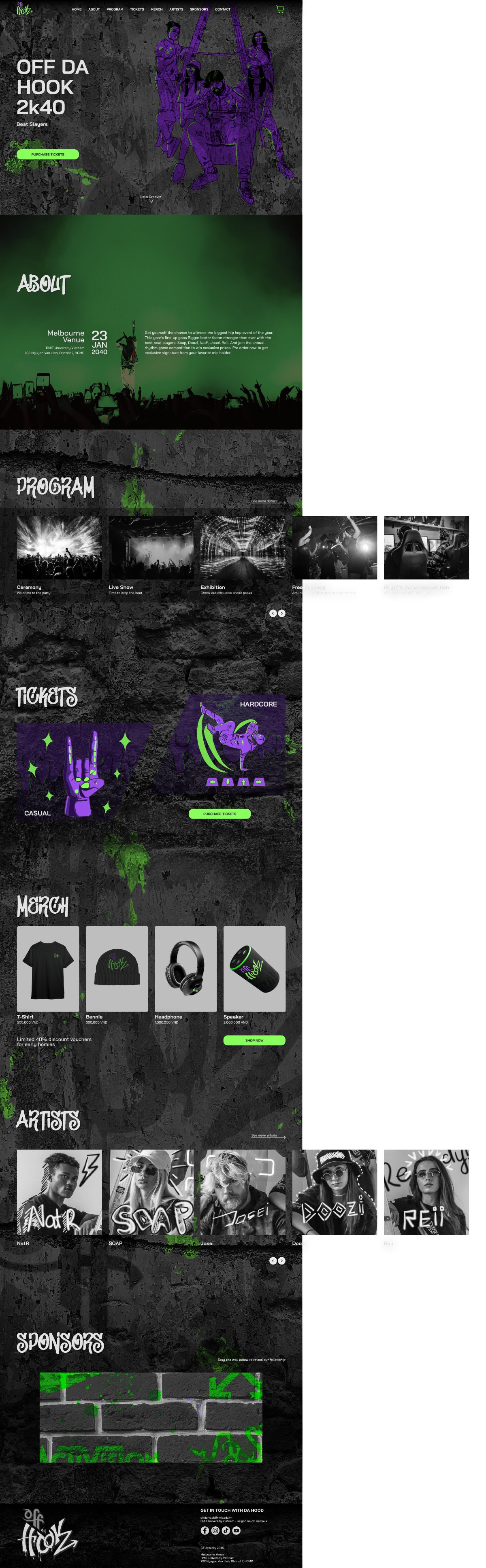
Scroll inside the frame to explore the full design. Buttons in these exported images are not interactive.
The material documents visual exploration, interface states, and desktop/mobile layouts. It does not include usability-test results or conversion data. The useful next step would be to test whether visitors can locate event information and ticket actions without the expressive graphics competing for attention.